

Back
Aggie IX
Helping students discover campus beyond the map
A mobile app concept that helps Texas A&M students find student-rated campus locations and explore university traditions through simulated augmented reality.
1st Place
Out of 17 teams
14 hours
Of design work

Role
UX/UI Design & Interactive Prototyping
Team
4 members
Date
April 2025
Tools
Figma, Photoshop, Premiere Pro
From campus idea to interactive prototype
I collaborated with a teammate on wireframes, high-fidelity designs, reusable UI components, and Figma interactions. Our four-person team also gathered student feedback to inform the concept and evaluate the prototype.
See how Aggie IX works
Explore the interactive Figma prototype. Some elements are not fully functional.
Try the Figma Prototype ↗
Prototype Walkthrough
Full prototype walkthrough · Recorded demonstration
The challenge: finding more than directions
Finding a campus location doesn’t necessarily tell students whether it’s a good place to go.
Maps can help students locate buildings, but don’t always provide information about individual study spaces, bathrooms, and other campus facilities. We wanted to explore how student recommendations could help Aggies find places suited to their needs while making university traditions easier to discover.
Understanding how students find campus information
While developing the concept, we surveyed 22 Texas A&M students about where they found campus information. Word of mouth and Google were the most frequently mentioned sources.
The responses provided useful context, but the short competition timeline limited how deeply we could investigate student needs or validate our proposed solution.
22
Early discovery responses
Students surveyed during ideation
Where students found campus information
16
13
5
3
Word of mouth
Aggie Map
Online communities
22 early discovery respondents. Students could mention more than one source.
Prioritizing everyday needs over novelty
We made the campus map the default experience because students would likely use it more often to find everyday locations than to explore traditions.
Students could browse student-rated study spots, bathrooms, restaurants, and cafés, while a separate AR-inspired experience helped them discover campus traditions.
The goal was to give students a useful everyday tool without making the AR experience the app’s only purpose.
Campus Map
Browse nearby locations and student-rated recommendations.
AR Traditions
Explore the Reveille Memorial and its connection to Texas A&M traditions.
Designing the campus experience
I collaborated with a teammate on the wireframes and high-fidelity Figma designs. As we refined the layouts, we added category filters, location labels, and more detailed information to help students explore nearby places.

Initial wireframes showing the map, AR traditions, settings, loading screen, and menu screens.

Final high-fidelity designs showing the map, AR traditions, settings, loading screen, and menu screens.
Bringing traditions to life through simulated AR
We combined real campus footage with directional arrows and graphics to demonstrate how students could navigate to landmarks and learn about Texas A&M traditions. Rather than building a functioning AR feature, we used edited videos to simulate the intended experience.
Following directions to Century Tree
Animated graphics at the Reveille Memorial.
Learning from early feedback
Feedback on our nearly finished prototype revealed that some interactions weren't clearly communicated.
Feedback
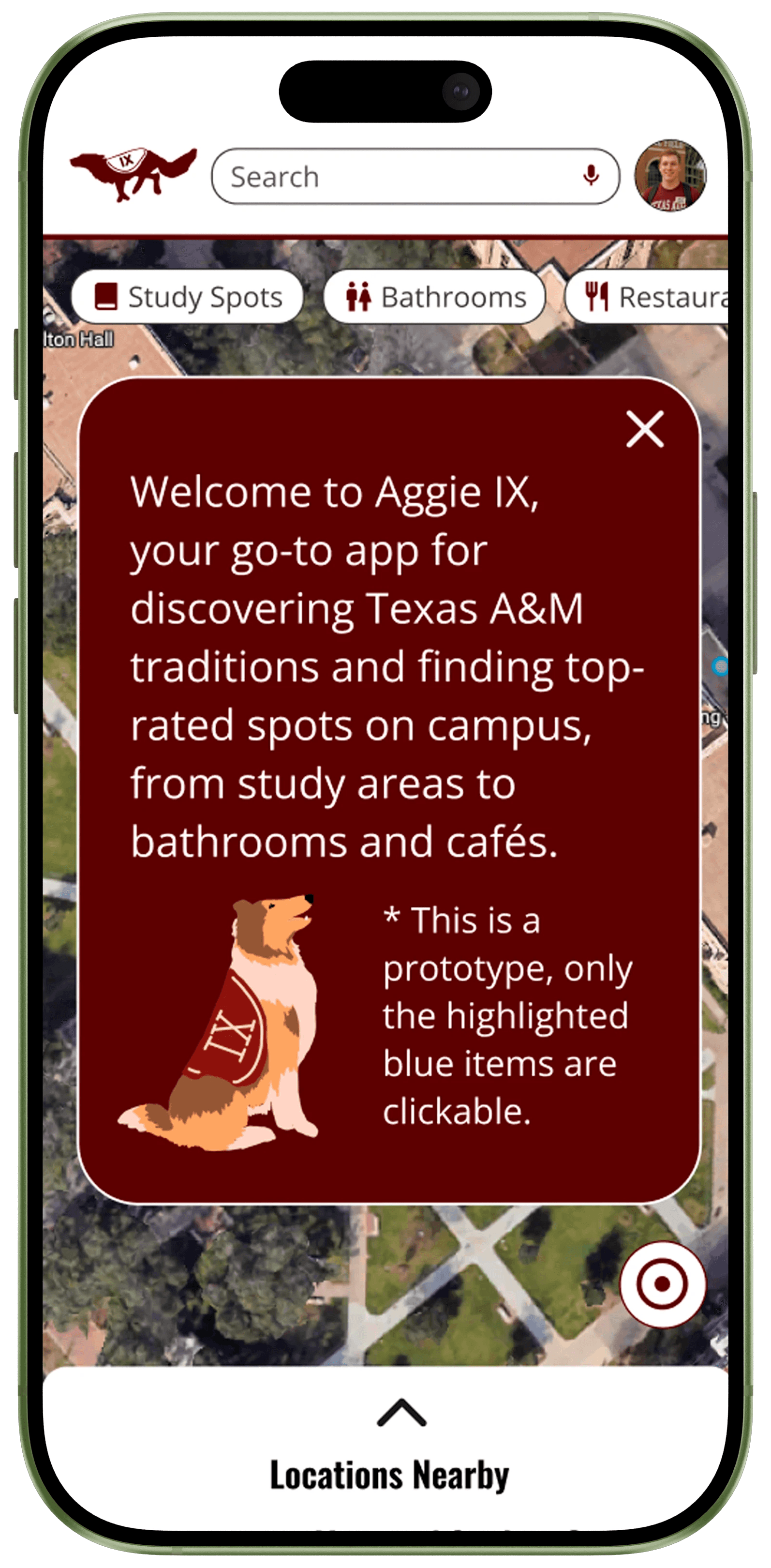
Some students couldn't tell which elements were clickable because the Figma prototype was only partially interactive.
Change
We added a note to the welcome screen explaining that only highlighted blue elements were clickable. We didn't have time to test whether this resolved the confusion.
Outcome and judges’ feedback
The judges recognized the strengths of our prototype and overall design approach while identifying areas that needed further development.
Judges’ feedback
Judges highlighted our student survey, polished visuals, and simulated AR experience. They also encouraged us to better define the problem, differentiate Aggie IX from existing tools, and establish clearer success metrics.
What we'd do next
If we continued developing Aggie IX, I would conduct more student research and usability testing to better understand their needs. I'd also refine the UI to create a more polished and distinct design, using how easily students complete tasks and where they encounter difficulties to guide improvements.
What I learned
A polished prototype doesn’t necessarily mean the design has been validated.
The 14-hour design sprint taught me how to prioritize features and collaborate under tight constraints. I strengthened my Figma skills while helping teammates learn components and prototyping features.
The experience also showed me the importance of understanding users before committing to a solution. While we created a detailed interactive prototype, our limited research and testing meant we couldn't fully determine whether it addressed students' needs.
Our Ideathon pitch
The team’s presentation of the problem, concept, and prototype.
Team presentation · Product@TAMU Ideathon